What is the Workflow Builder?
Workflows are a description of a graph of components. Workflow graphs can be as simple as a few components needed to grab data from a dataset and transform it into an email message, or they could include hundreds or thousands of components for processing, controlling flow, manipulating and publishing data, and providing monitoring updates to users.
In all but the simplest cases, understanding the connections between these components can be next to impossible from reading the JSON object notation for a workflow. For this reason, Aunsight provides the Workflow Builder, a software interface for visually editing the components of a workflow. The current article describes how to navigate the Workflow Builder interface to view or edit a workflow. It is presumed that users already know how to use the Workflows workspace and are familiar with the basic concept of workflows as a graph of components. After learning about this interface, users may want to try their hand at creating a simple workflow from scratch.
Understanding the Interface
To reach the builder interface, log in to the Web interface and select the context you wish to work in through the context selector. From that context's dashboard, click the "Workflows" icon ( ) in the palette on the right.
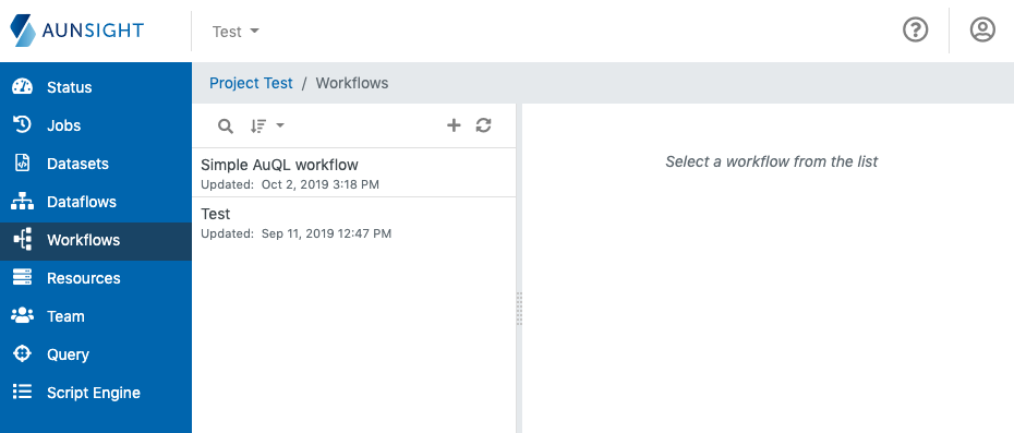
Search or sort the list of workflows and click on the name of the desired workflow, or create a new workflow and bring up its record in the Workflows Workspace.
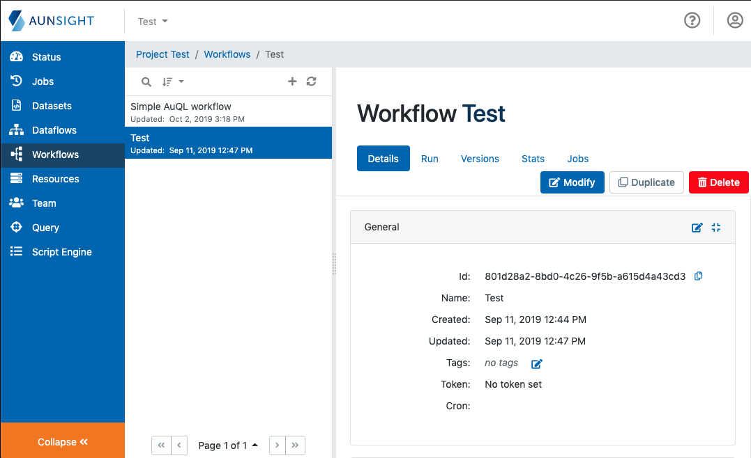
The workflow workspace allows users to view or edit workflow metadata. To get to the Workflow Builder interface, click the "Modify" button.
There are three parts of the Workflow Builder Interface: The toolbar, the canvas, and the component details panel.
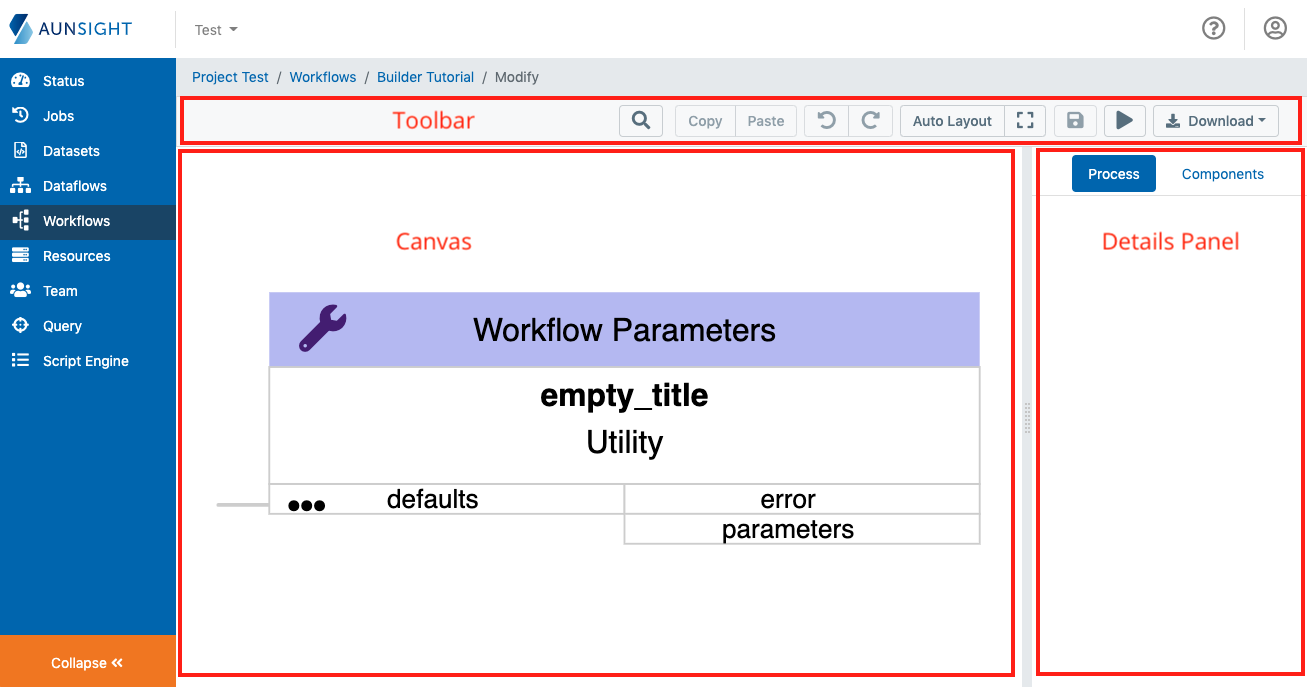
The Toolbar
The toolbar provides buttons for workflow tools like:
 - Opens a search box for finding a component by name
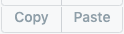 - Copy selected components to the clipboard or paste from the clipboard
 - Under and redo
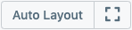 - Auto Layout: Rearranges components automatically; The icon to the left zooms the canvas to fit the components
 - Saves the workflow design changes in a new version. (Using workflow version history)
 - Runs the workflow
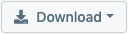 - Download the workflow as a full JSON file or an SVG vector graphic map of the components
The Canvas
The canvas is the main point of interaction for the Workflow builder interface.
Users can zoom the canvas view in or out by using the mouse wheel (or its equivalent gesture) and can navigate by clicking and dragging on empty space.
Every component that is a part of the workflow is displayed in this space. Each component is displayed with a title that is semantically color-coded by component type and has its component type displayed at the top row. Underneath it, the canvas displays the component name and the service library of which it is a part. Underneath this, the input and output connections are displayed to the left and right respectively.
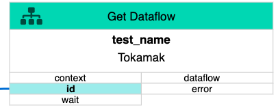
Connections between components are visually displayed by lines draw between the input and output ports of each element.
Components can also be moved by clicking and dragging the components to re-arrange the visual relationship between the components and their connections. Users can also automatically re-arrange or navigate the canvas by clicking the Autolayout or Zoom buttons () on the toolbar.
Details Panel
The details panel to the right of the canvas provides a space where component details can be displayed and edited. The details panel has two tabs, "Process" and "Components".
The Components Tab
The components tab of the details panel displays a foldable list of components available for use in workflows. Similar to a "tool palette" in drawing programs, the list of components can be added to a workflow by clicking on their names.
The Process Tab
The process tab of the details panel displays the details of a particular component. When a user clicks on a component in the canvas, the detail pane will automatically display the details of that component.
Component details are grouped into three sections: Metadata, Inputs, and Outputs.
Metadata Details
The component metadata details contains fields regarding the ID (internal name), name (displayed name), and a description of the workflow component selected.
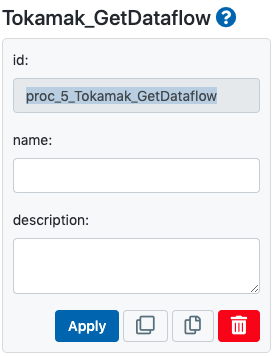
Beneath these fields there is a group of action buttons for working with this component:
 - Applies changes to the component
 - Duplicates the component in the current workflow
 - Copies the ID of the element
 - Deletes the element
Inputs and Outputs
The inputs and outputs sections define the connections provided by type of component. Inputs are similar to arguments passed to a function. Outputs are similar to the values returned by a function. Each component has different expected inputs and outputs, and not every input or output listed for a component is required. Required components will generally be displayed in the canvas in red text until they are specified.
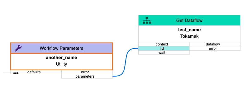
While component inputs and outputs can be specified by the forms provided on the details panel, users can visually build connections by dragging and dropping the input of one component onto the output of another.
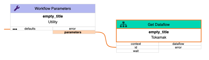
When two components have a connection, this will be displayed on the canvas. The preceeding example shows how the ID input for the Get Dataflow component is provided by the Workflow Parameters component (a component representation of the parameters passed to the workflow at runtime).